Brisk Air
ROLE
Product Designer, UX Researcher
SCOPE
iOS App
TIME
3 months, 2023
TOOLKIT
Let's get flying
Some interesting facts about flights:
✈️ The first transatlantic flight took place in 1919. It took 24 days.
💧 Your body loses about 1.5l of water in a 3-hour flight. Make sure you stay hydrated.
👎 Online flight booking is notorious for its bad user experience. You probably knew that one.
I designed Brisk Air as part of my course with UX Design Institute. I chose an online industry with a tedious user journey and gave it a UX makeover.
Erm, what’s the problem?
It takes way too long to book flight tickets. It is frustrating. It feels like a minefield with little traps that the airlines set to trick you into getting extras. Somehow, you never know what you’ve paid for until the flight attendant stops you at the gate. You don’t have a carry-on included.
Why can’t the experience of booking be smooth and transparent?
The goal
Design an app for quick and straightforward flight booking.
Eager to see the final design?
See the prototype on Figma 🤩Or read on for all the juicy details.
There will be a link at the end as well.
Process
Get to know the problem
I conducted three types of research to better understand the issues users face when booking flights online.
Research goals:
- Understand people's processes when booking flights.
- Learn about their goals and pain points.
Competitive benchmarking
I started by looking at other apps for booking flights. I explored British Airways, Emirates, EasyJet and Ryan Air. This helped me gain a clear idea of conventions and start identifying potential design pitfalls.
These are the three overarching issues I discovered:
- Too many clicks
Most apps don't have a flight search form available upon launching the app. The user needs to open the form to start their search. This is followed by a long process with many screens, often unnecessary. - Messy interfaces
Screens are cluttered with ads and extras. Through the entire user journey. They are invasive and distracting. - Choice paralysis
Too many options make it harder to choose. Different ticket tiers can lead to confusion.
Survey
Once I had an overview of best practices and design pitfalls, it was time to learn from the users. I conducted an online survey to get more specific with my research insights.
The goals of the online survey were to learn about:
- Users' goals and pain points when booking flights.
- How does the experience make them feel?
- What device do they use and why?
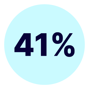
Visited to book a flight
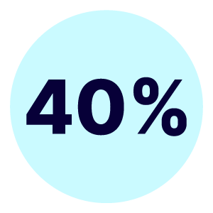
Felt negatively about their experience
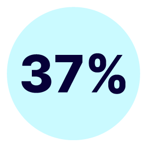
Would like to improve the clarity and declutter the app/website
Only 7% of survey takers use an app to book their flights. Although our phones are always within reach, most prefer to book on desktop. This is because desktop gives a better overview of the interface and mistakes are less likely to happen. I chose to work on an app design because I wanted to challenge myself and tackle these design issues in the space where they are most prominent.
User interviews
Now that I had the context from the benchmarking and survey, it was time to dive into user interviews.
These are the areas I was looking to learn more about:
- Is the language used clear to the user?
- Do they understand how to operate the interface?
- How does their user journey look like?
- Where are the friction points?
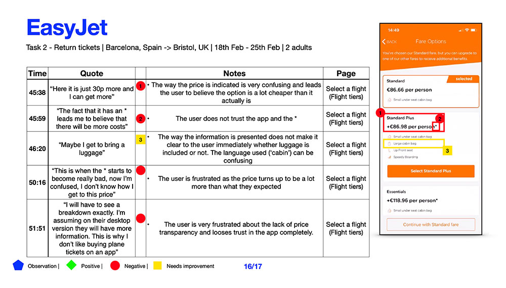
👆 Notes from a usability test with user
Here are some of the valuable insights I discovered:
- Crucial information about what the ticket includes is presented in misleading ways. Price transparency is lacking.
- Cleaner interfaces and simplified processes are appreciated.
- Mental models between users and interface are misaligned
- Ads and extra offers are viewed as annoying and aggressive
Speak of the Devil
I organised all research insights in an affinity diagram. This way I could grasp all the information and define the problem better. This helped me identify the areas in the user journey where the issues were most prominent.
Affinity diagram
I colour-coded each insight. Then I placed it in its space based on the stage of the user journey it was concerning. That way I got a very clear overview of where exactly users were getting good experience and where it was bad. A cluster of red sticky notes is bad.

👆 A snapshot from the affinity diagram.
Click to have a detailed look at the affinity diagram.Customer journey map
To get things more organised, I structured my summary from the affinity diagram in a customer journey map. This gave me a very clear overview of the user's goals, behaviours, context and pain points at each step of their journey. The scope of my design work was becoming clearer.
Click to have a detailed look at the customer journey map.Let's get to work
Now that all research information was digested, it was time to start designing. My first job was to identify the most common user flow, the 'happy path'.
Flow diagram
I put little reminders of goals and pain points at every step to keep in mind when designing each screen state. Now my documents were starting to look more like action plans.
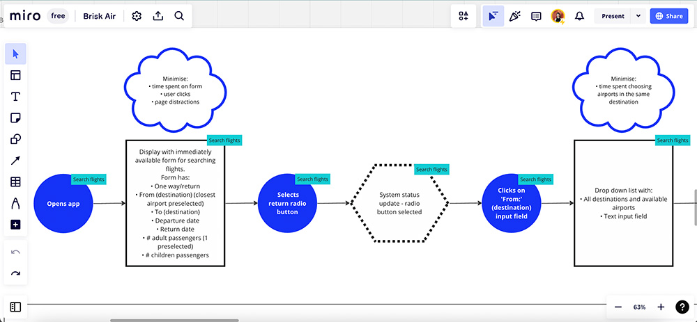
👆 A snapshot from the flow diagram.
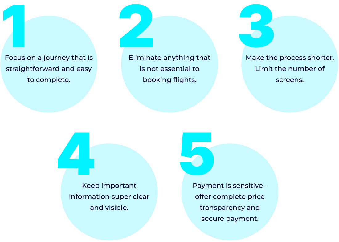
Click to have a detailed look at the user flow diagram.Once this was done, I could identify 5 overarching 'rules' to follow:
Sketches
Following the above points, I sketched out the different screens and screen states.
Sketching simple screens like the flight search form was straightforward. It involved minor iterations. However, more complex tasks such as selecting dates and seats needed a more elaborate design solution.
Seat selection
I wanted to design the seat selection process in a way that will:
- Require minimum effort from the user.
- Give them a clear overview of what is happening.
- Allow them to easily modify the input.
Since this was a process involving a few steps, I thought a type of progress bar can fit the purpose.
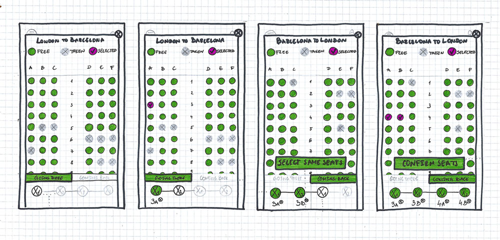
👆 The solution I came up with.
Date selection
When it came to the date selection process, there were two design approaches I could take.
Option 1
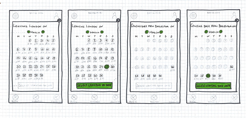
Option 1 requires the user to select leaving date and returning date on two separate screens. Each can be accessed through clicking the respectful input field in the flight search form. This approach segments the date selection process. It clearly defines two separate steps.
Strengths 👍
- The two steps are well defined and distinguishable. It is very clear whether the user is selecting inbound or outbound dates.
Weaknesses 👎
- The process involves more screens and clicks from the user. This makes it longer and it feels like more effort.
Option 2
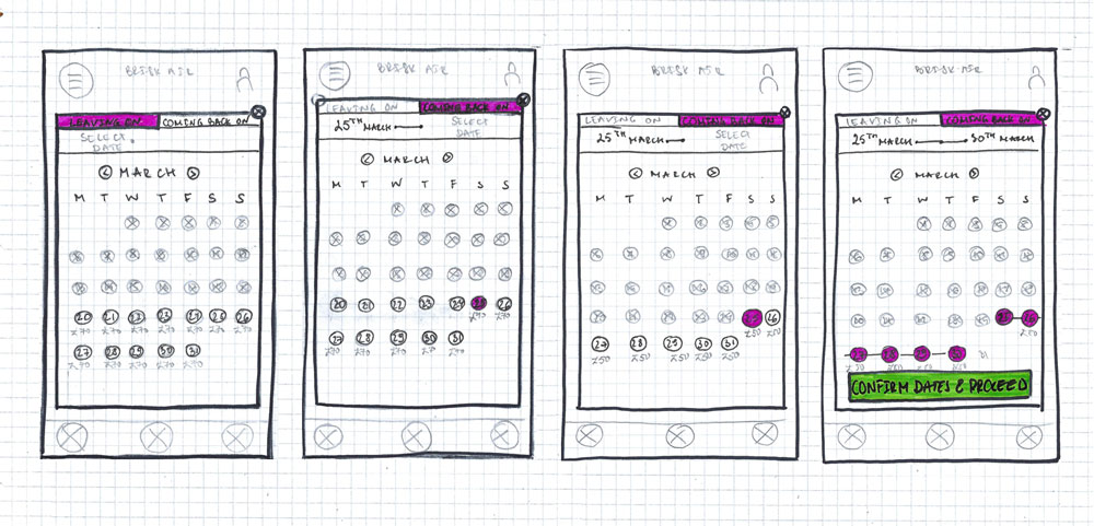
Option 2 allows the user to select both dates on the same screen. There is a type of progress bar that gives system feedback as the user selects the dates.
Strengths 👍
- The process involves less screens and effort from the user. This makes it feel easier.
- The mental model is similar to the one used for the seat selection process.
- The duration of the trip is presented very clearly.
Weaknesses 👎
- The steps of selecting dates are less segmented. This can make the user hesitant whether they are selecting the inbound or outbound date.
The strengths in Option 2 outnumbered the limitations. Most importantly, it was following a similar mental model to the one in the seat selection process. That would make the whole flow seem more cohesive. I decided to go with Option 2 and test its limitation when user testing the prototype.
Prototype
As I started moving my sketches from the paper to Figma, I made sure to follow Apple's Human Interface Guidelines. That way the UI of the app would feel more familiar to iOS users.
 Check out the prototype in Figma 🤩
Facing the music
It was time to test Brisk Air with users and get the results in.

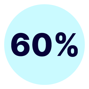
less time to book flights on Brisk Air
than other airlines
Strengths 👍
- Booking flights on Brisk Air is faster compared to popular alternatives.
- The process is simpler. There are no distractions and "spammy" add-ons.
- Pricing is more transparent.
- A smoother experience.
Weaknesses 👎
- The interface is not polished enough visually. It feels "more dull".
- The CTA on the passenger detail screen does not activate unless the keyboard of the last input field is closed. This confused some of the users during testing.
Learnings
Here are the valuable lessons I learnt working on this project:
- Keep the scope of work narrow and precise. This helps design a product that is very good at one thing rather than mediocre at a lot.
- When in doubt, take an educated guess and test with users. No need to waste time contemplating. The user has the final answer.
- Keep it simple. Nobody will voluntarily spend any time trying to figure out how a product works.


 Check out the prototype in Figma 🤩